Summary
Purpose
Fitness trackers rely heavily on conveying information through either a mobile app or dashboard; it is a major part of the wristband's experience. With this project, I set out to identify pain points within the onboarding experiences of three different fitness trackers (Atlas, Fitbit and Garmin) and ideate potential solutions.
Process & Methods


Background
Fitness trackers are becoming more and more ubiquitous—a report by NPD found that 1-in-10 U.S. adults own a fitness tracker (2015), and about half of the fitness-conscious people I surveyed have owned a fitness tracker. About 89% of those people consider the corresponding mobile app important and most of the users who rated the app a 4 or 5 (out of 5) also continued to use the wristband. The users who stopped using a wristband rated the corresponding app about a 3.5 on average.
This data suggests a relationship between the quality of the app and user retention rate for the corresponding fitness wristband. I specifically chose to focus on the app's user onboarding because it is pivotal to retaining customers and it boosts the probability that users will come back again. First impressions matter, whether it be with people, or with products.
Test Parameters
What: the ATLAS, Fitbit & Garmin mobile app user onboarding process
Who: individuals interested in health and fitness
How: combination of user interview & usability study
Test Setup
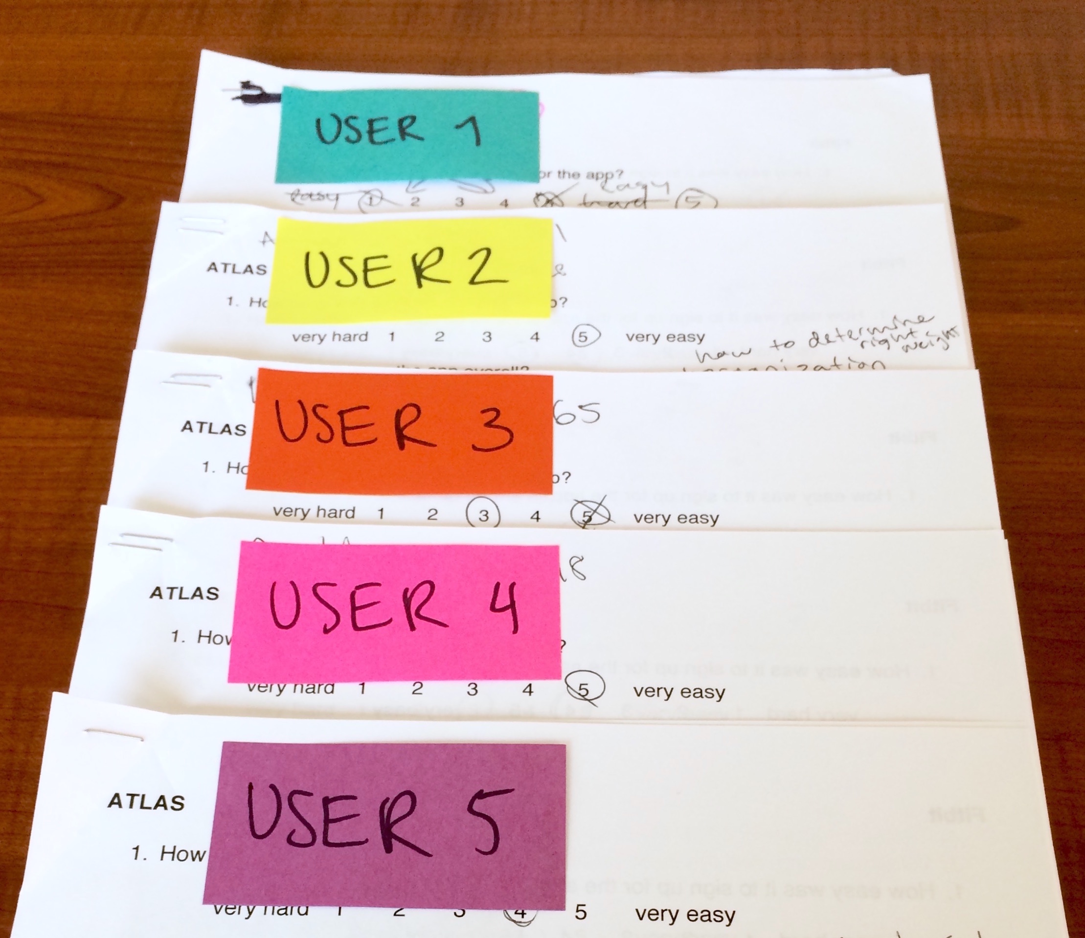
Five volunteers were given the following scenario:
“You are looking for a smart fitness wristband and are evaluating 3 different options. You download the corresponding apps (ATLAS, Fitbit and Garmin) for each wristband and want to check them out to help make a decision.”
I had the apps pre-downloaded on my phone and had all the users go through the onboarding process for each app. They were asked to think out loud and comment on what they were doing. The onboarding process here was dictated by the user--whenever they felt like they had explored the app enough, they stopped. Afterward, I asked them a series of questions, summarized below.
App Audits
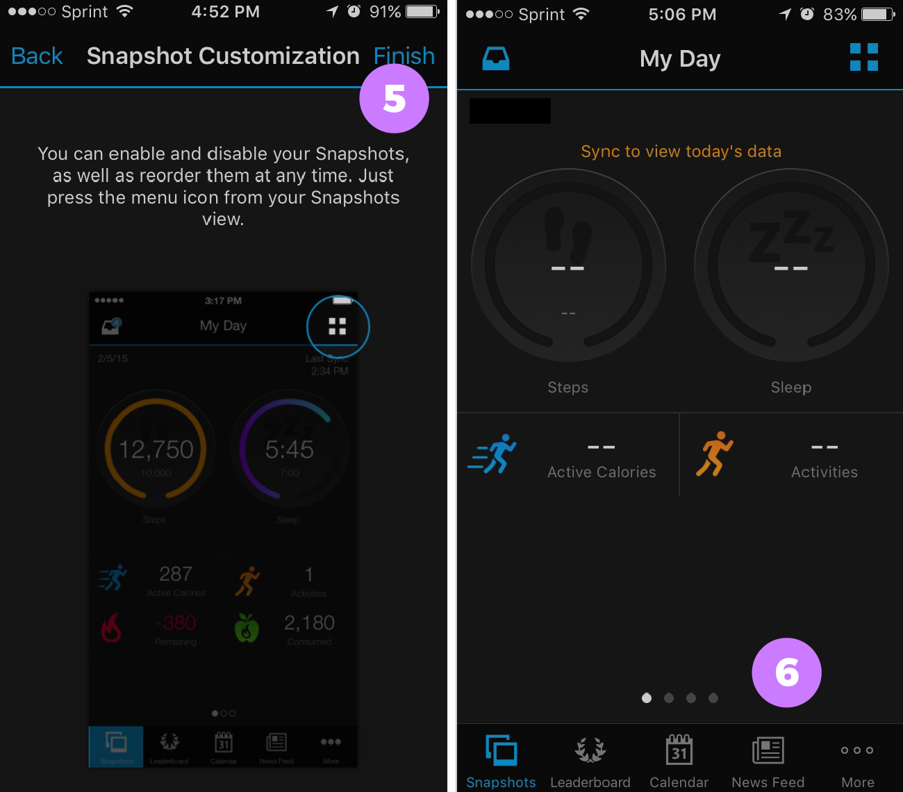
The prototypes of the Atlas, Fitbit and Garmin apps below are not exact replicas. I created them by taking screenshots of the actual app screens and stitching them together using Adobe Experience Design. They are for informational purposes only--to show an overview of how the apps looked at the time the study was conducted. Some of the features/screens were not documented. Emphasis was put on documenting the key onboarding screens of each of the apps.
Analyzing the Qualitative Data
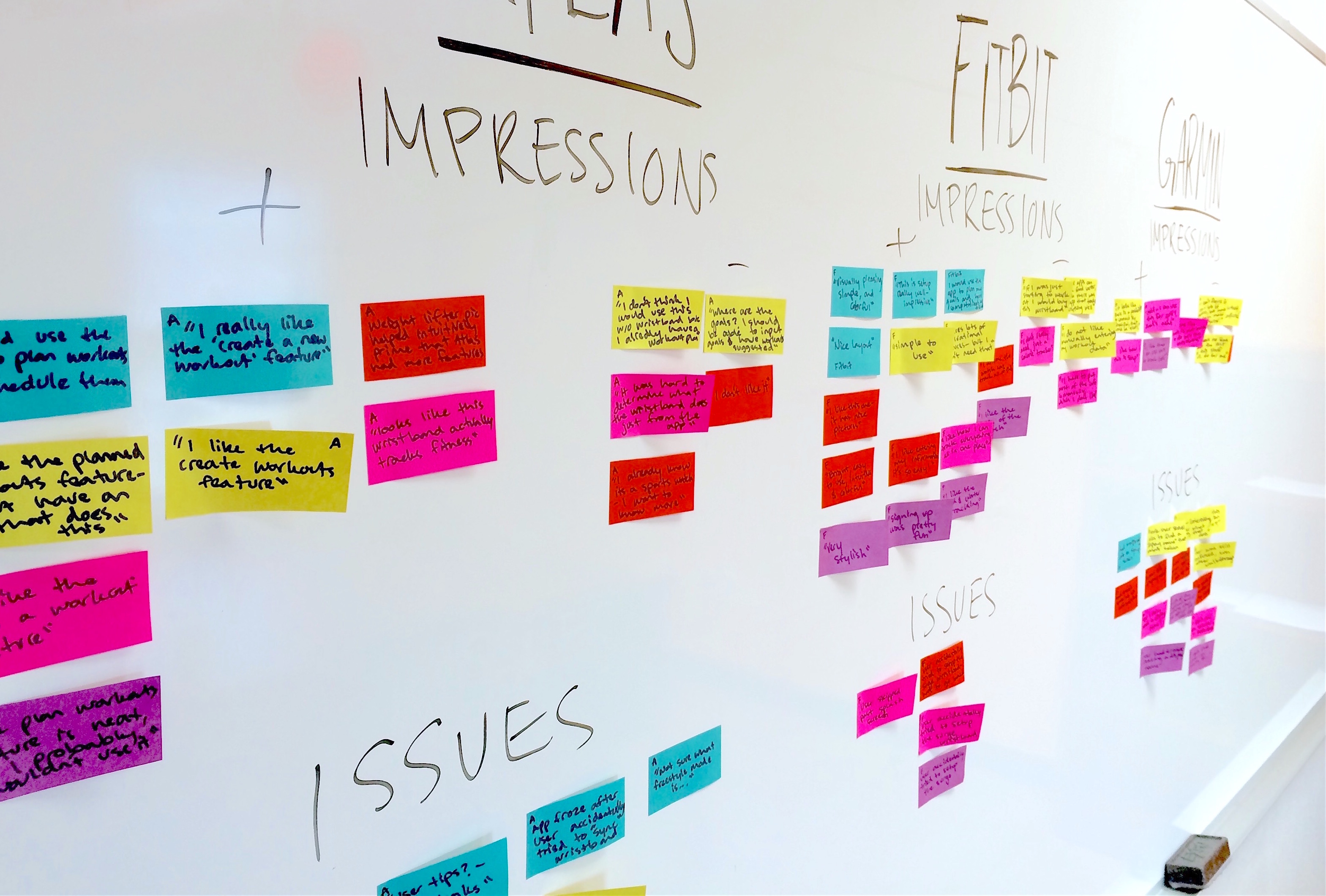
As I observed users walking through the onboarding experiences for each of the apps, I wrote down significant thoughts they had about the process, as well as any issues they encountered. To better understand the raw data I grouped user thoughts and observations into "positive impressions", "negative impressions", as well as "issues" for each of the apps.
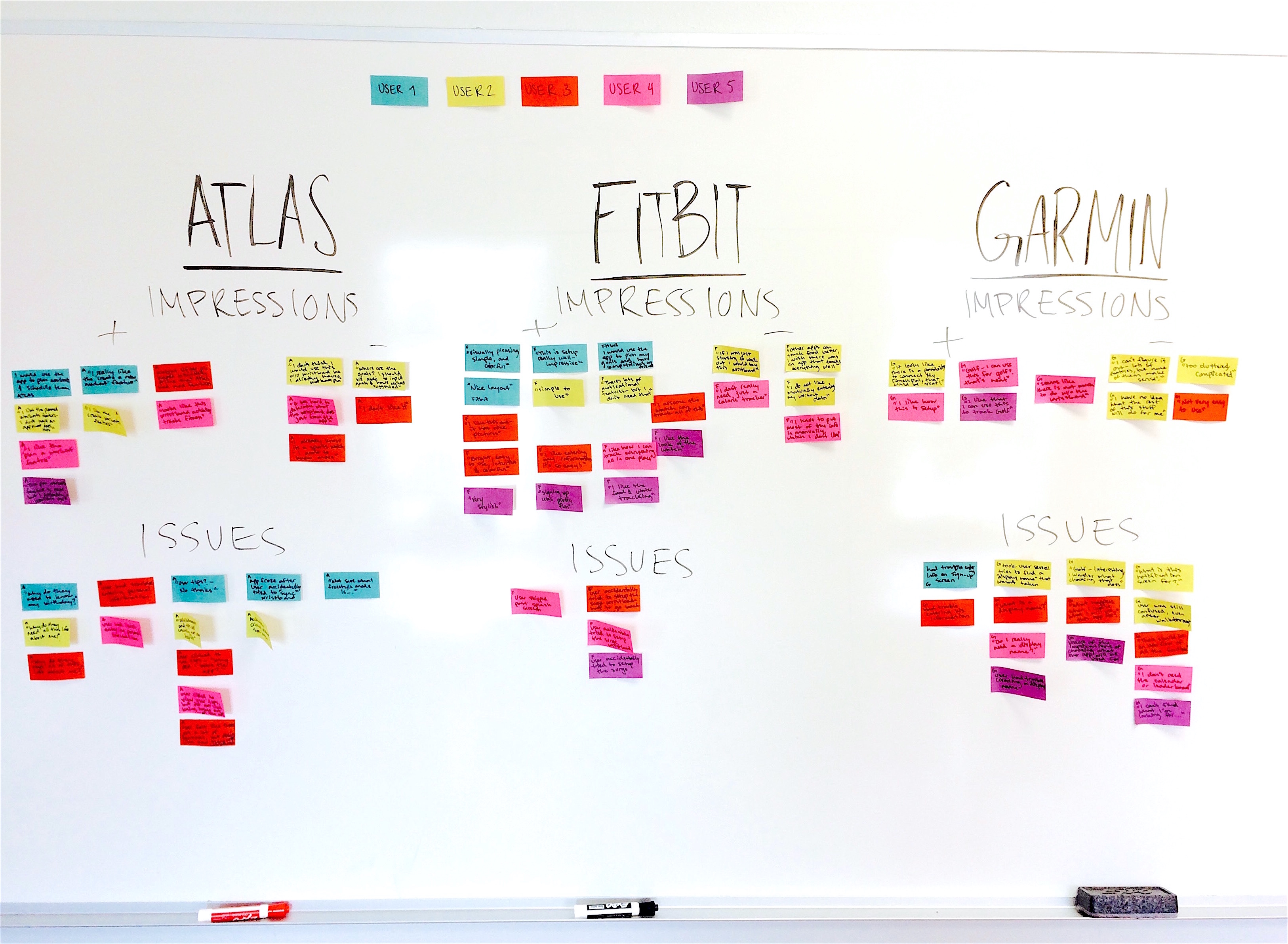
The Fitbit app, by far, elicited the most positive comments, and users encountered the least issues. The Altas and Garmin app presented the most issues for users.
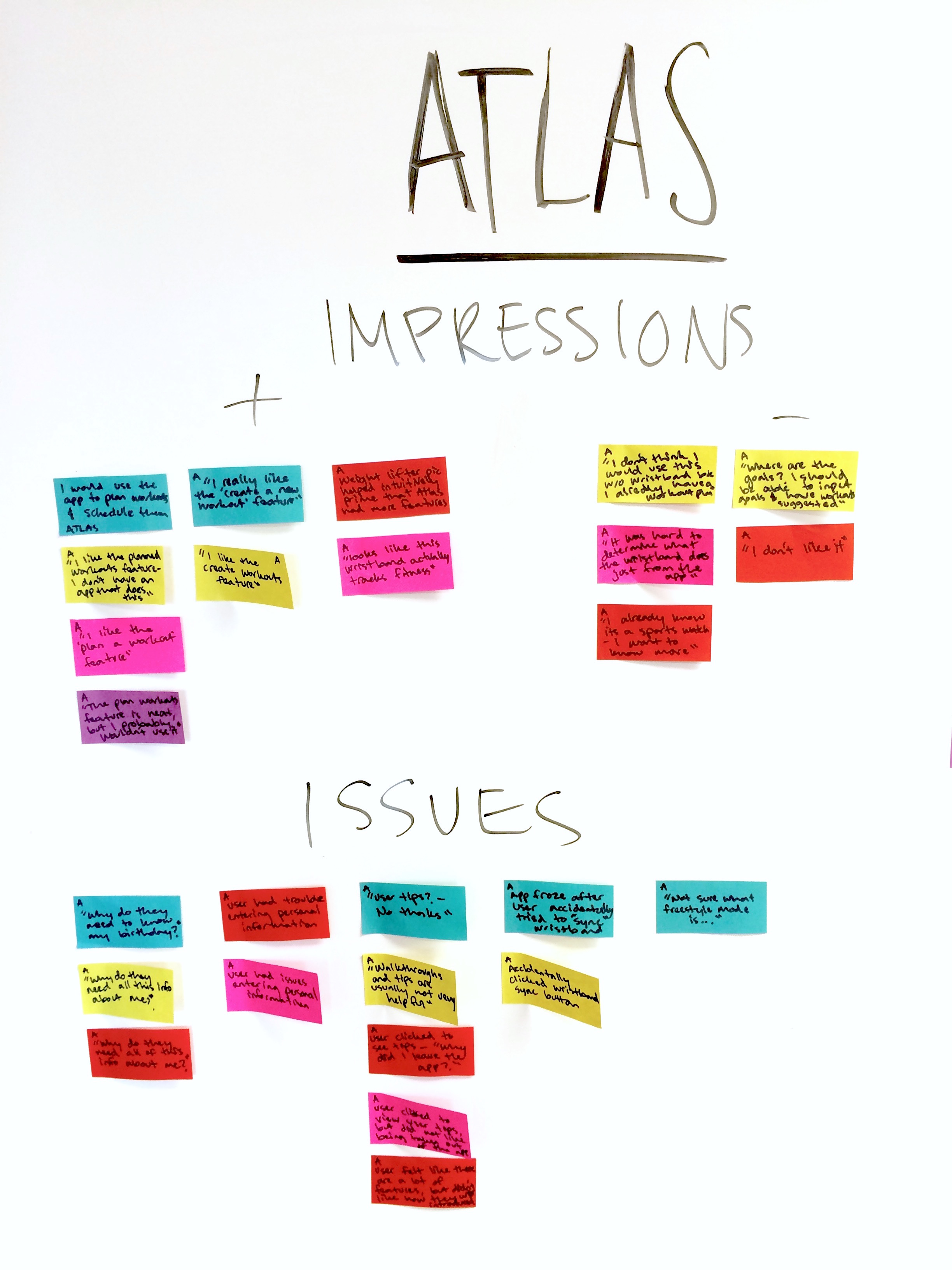
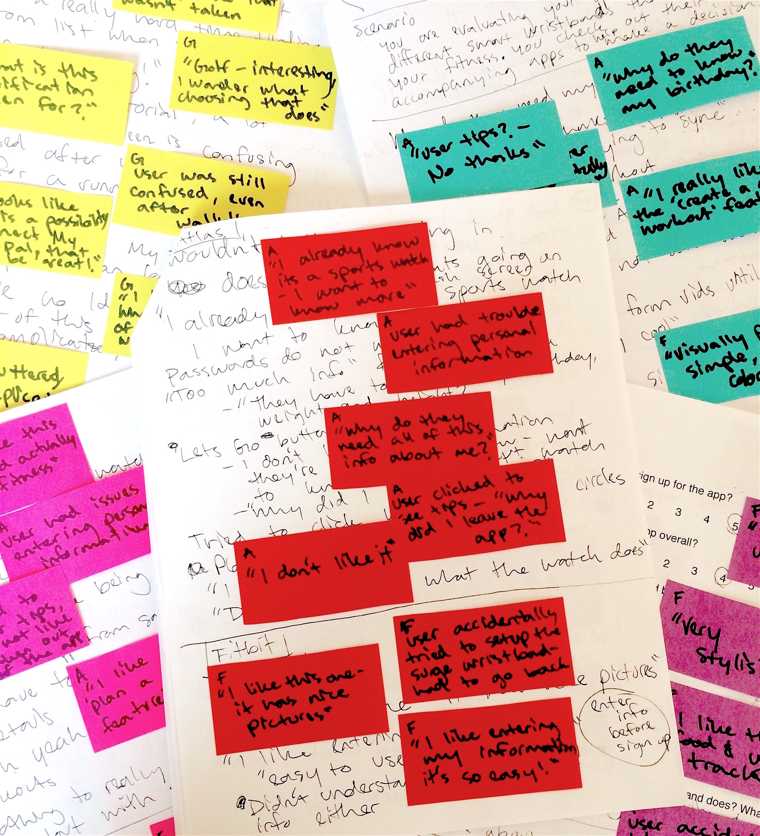
Atlas Impressions
The overall impression of the Atlas app was that it is for people who are serious about their workout. Most users liked the features of the app--especially the “plan workouts” section where users could create their own workout plan. One user flat-out did not like the app because they felt it was hard to use.
Atlas Pain Points
As I observed users walking through the app, I noticed 4 main issues that users kept running into.
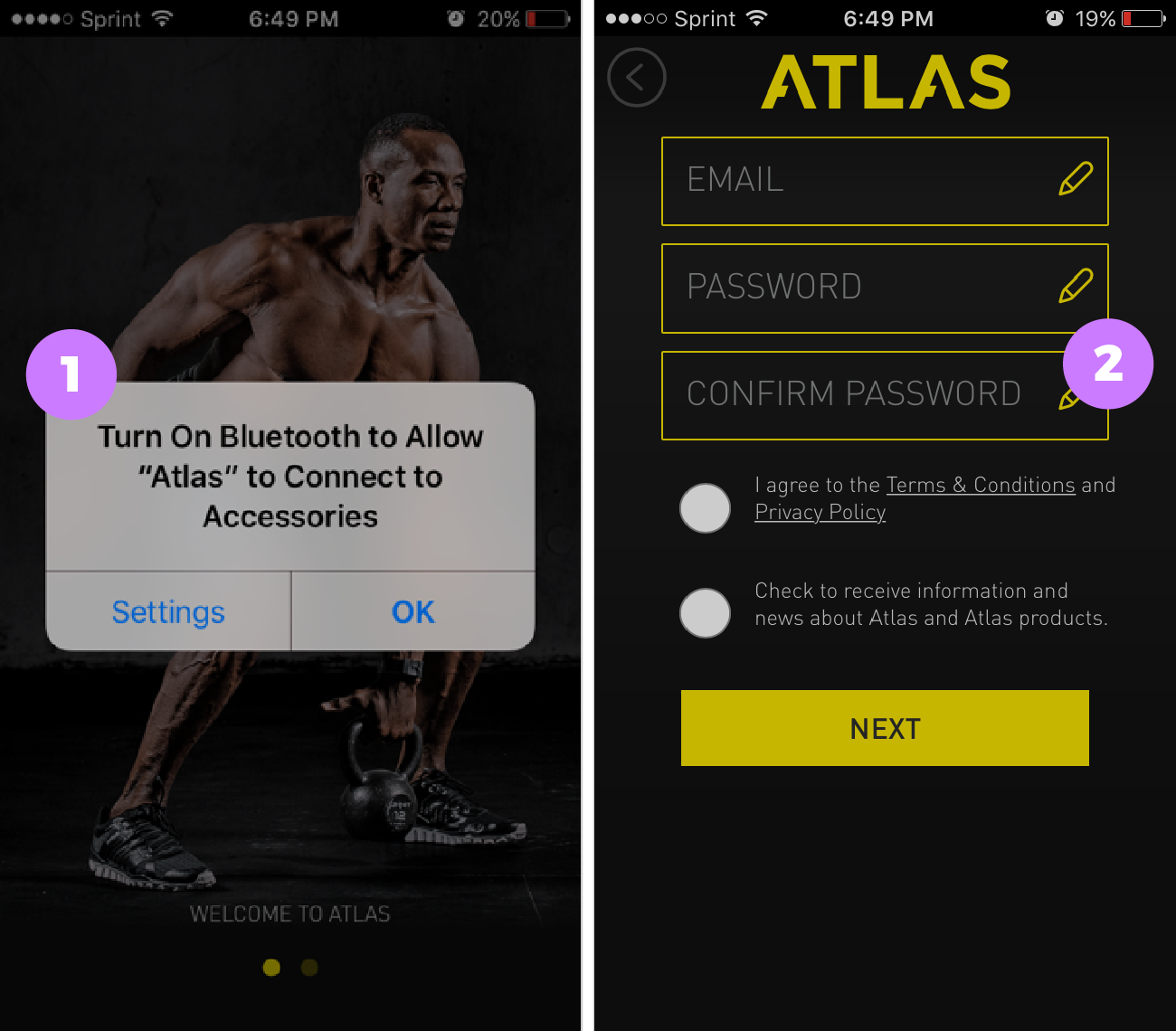
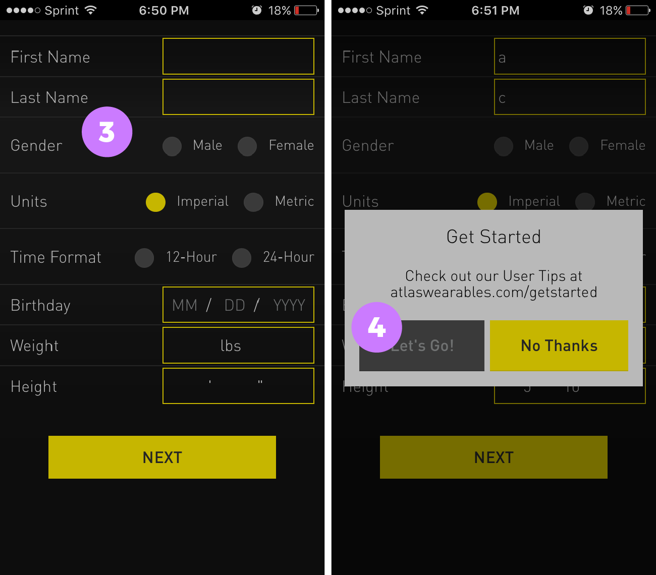
Pain Point #1: Users were apprehensive when asked for permissions upon opening the app
Right when the app is opened, before signing up or signing in, users were asked to turn bluetooth on. Most of the users I boserved became noticeably agitated with the notification.
Pain Point #2: Users had trouble retyping their password
Some users struggled with the re-typing of their password. Navigating between the small input fields did not help.
“Why do they need all this information about me?"
Most users were apprehensive as to why they needed to input a bunch of personal information when signing-up. There was no prompt to let users know why they were being asked for their personal information.
“Why did I leave the app?”
Most users skipped viewing the tips, and the users that did click to view the tips, did not like being taken out of the app to view them.
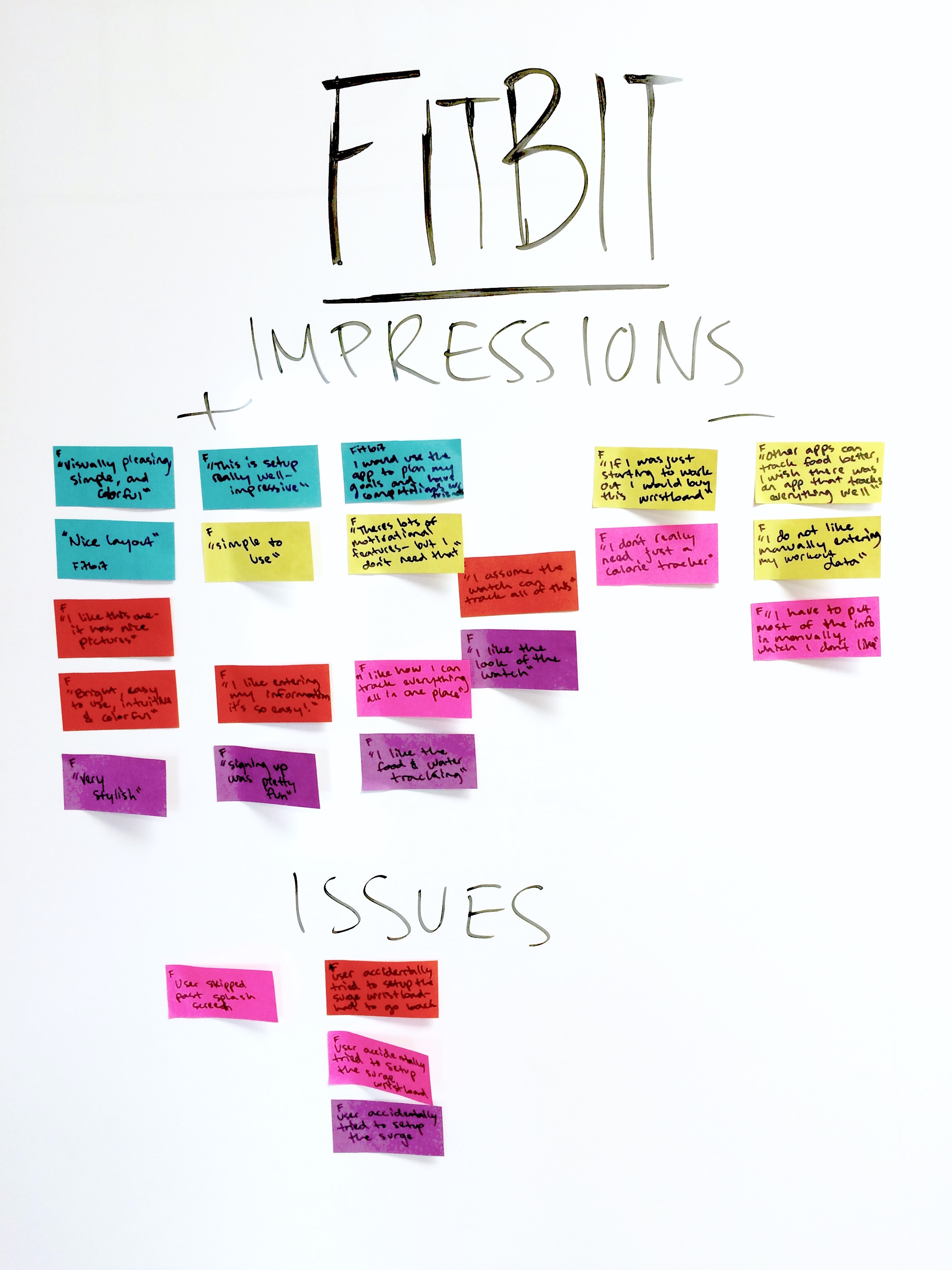
Fitbit Impressions
Users liked the bright colors and simple design of the Fitbit app. Everyone really enjoyed the sign up process, which took a novel approach by splitting each input field into a different screen and making it more interactive. Some users really liked having a place to track everything--exercise, food intake, water consumption, etc., but some felt it was too much.
Fitbit Pain Points
Pain Point #1: Users did not want to sign up just to explore the app, but they didn't have a choice
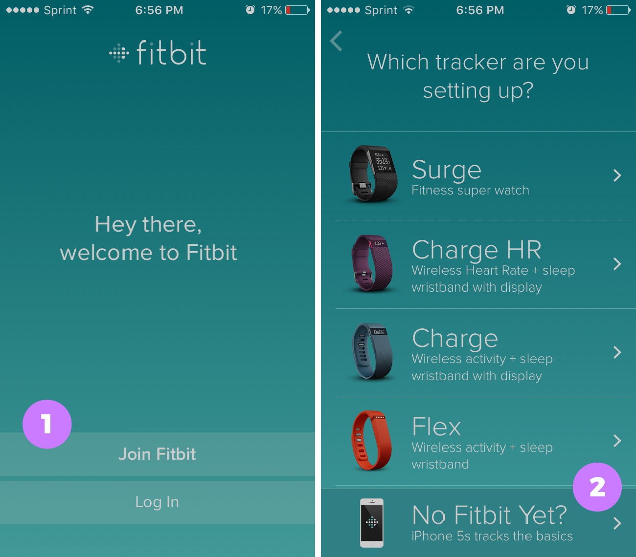
Users either had the option to "Join Fitbit" or "Log In" on the welcome screen. There was no option to explore the app without joining or signing in. Although this issue came up with the other apps as well, I chose to highlight this issue here since the other aspects of the Fitbit onboarding experience were so seamless.
Pain Point #2: Users who did not have a wristband yet did not see the bottom option of “No Fitbit Yet?” and start setting up a wristband on accident
When signing up for the app, even though there was an option at the bottom “No Fitbit Yet,” several users accidentally started setting up the top wristband (at the time, the Surge). The users would go through, enter all their information, and then the app would continuously try to “sync” the wristband, which wasn't there. Users were then forced to return back to the setup screen, thus restarting the sign-up process.
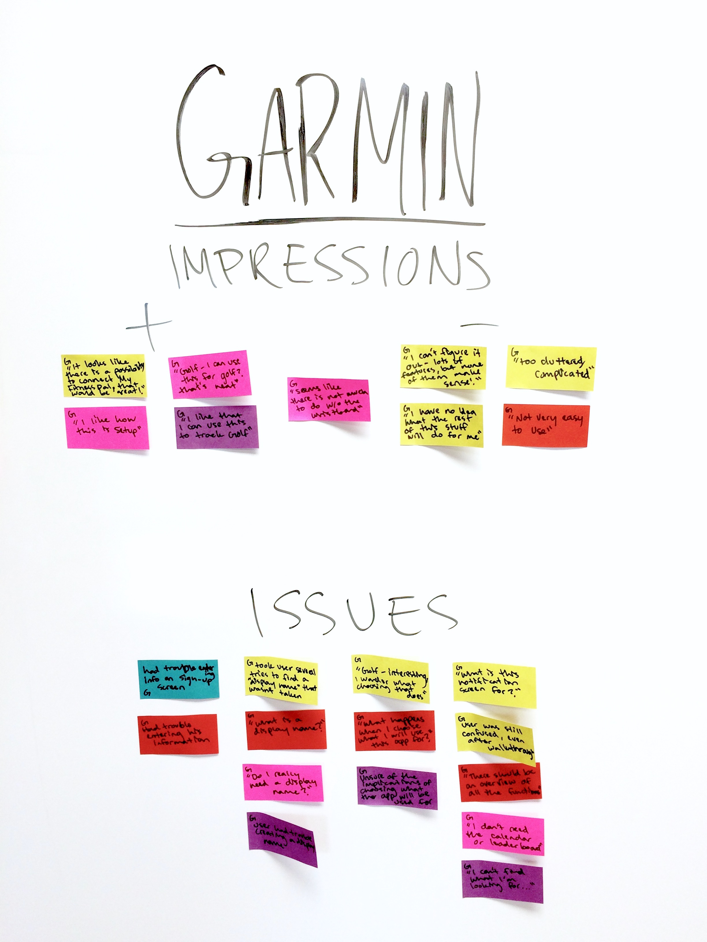
Garmin Impressions
Users felt the Garmin app to be the most confusing of the three. However, there was one user who mentioned they actually liked how the app was setup. This user, as well as another, liked the fact that the app hinted that the wristband could be used to track their Golf game.
Garmin Issues
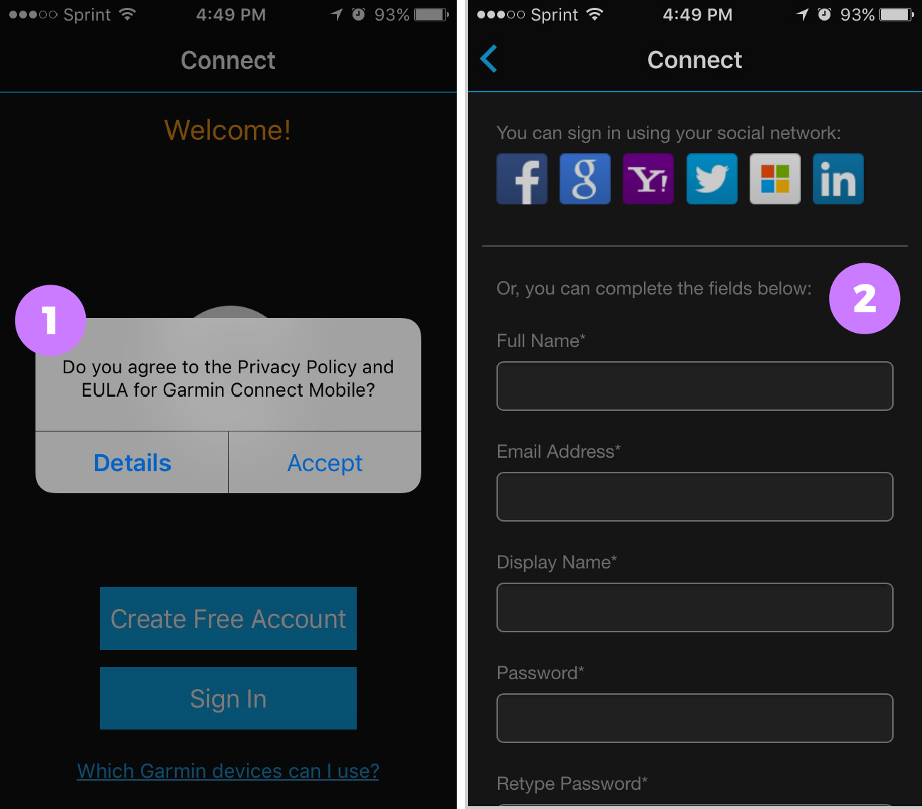
Pain Point #1: User were apprehensive to agreeing to a Privacy Policy and EULA right upon opening the app
Before signing in or signing up, users were asked to accept a Privacy Policy and EULA, with no option to deny. This was a bit scary for users as it was so sudden and they did not know what they were agreeing to.
Pain Point #2: Users had issues accessing the small input fields on sign up
There were several inputs required to complete on the sign up screen. The small input fields, and space between input fields made it hard for users to fill out the information.
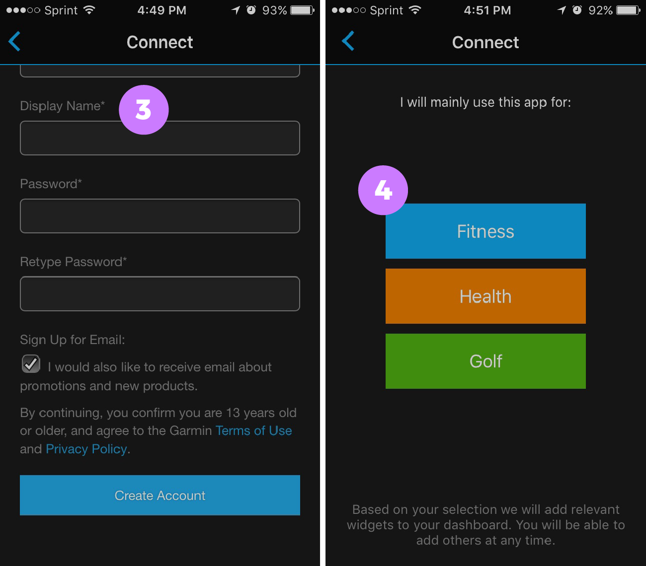
“Do I really need a display name?"
Pain Point #3: Users didn't understand why they had to pick a Display Name, and what it would be used forNot only did users not understand why they needed a display name, but they had a hard time finding a unique display name that wasn't already taken. It was required to sign up.
"What happens when I choose what I will use this app for?"
Pain Point #4: Users did not know what choosing “Fitness, Health or Golf” would doAfter signing up, users were asked what they would mainly use the app for: Fitness, Health or Golf. This created uneasiness in users, as they didn't know how it would affect the app in the future.
Pain Point #5: Users had a hard time following the introduction tutorial
The introduction tutorial was hard to follow for users. It featured long text with pictures of the app (within the app) highlighting the feature that was being explained.
"I can't find what I'm looking for"
Pain Point #6: Users did not know where to start on the home screen or where to look for certain functionalitiesAfter signing up and going through the tutorial, most users had a hard time figuring out what to do next once within the app.
Analyzing the Quantitative Data
After users were done signing up and walking through all 3 apps, I asked them a series of questions about how they felt about the apps. This type of data is not the most reliabe, as humans are not the best at self-reporting, however, it is interesting to compare users' perceptions between apps.
Q1: How hard/easy was it to sign up for the app?
| User | A | B | C | D | E | Avg |
|---|---|---|---|---|---|---|
| Atlas | 5 | 4 | 5 | 5 | 3 | 4.4 |
| Fitbit | 4 | 5 | 5 | 5 | 4 | 4.6 |
| Garmin | 3 | 4 | 5 | 5 | 3 | 4 |
Users self-reported that the sign-up process was considered pretty easy across the board. I was actually surprised with the general response to this question, because user comments led me to believe otherwise. Most users really enjoyed signing up for the Fitbit app, while slightly struggling with the Atlas and Garmin apps.
Q2: How displeasing/pleasing was the app overall?
| User | A | B | C | D | E | Avg |
|---|---|---|---|---|---|---|
| Atlas | 5 | 3 | 4 | 4 | 3 | 3.8 |
| Fitbit | 4 | 4 | 5 | 5 | 5 | 4.6 |
| Garmin | 5 | 2 | 3 | 2 | 3 | 3 |
The Fitbit app was found to be the most pleasing overall, ATLAS was second, and Garmin was last. It gets tricky when you try to understand what makes an app “pleasing,” however, user comments helped shine some light on the results.
Q3: How unlikely/likely is it that you would buy the corresponding wristband?
| User | A | B | C | D | E | Avg |
|---|---|---|---|---|---|---|
| Atlas | 4 | 2 | 2 | 3 | 1 | 2.4 |
| Fitbit | 1 | 4 | 4 | 3 | 4 | 3.2 |
| Garmin | 3 | 1 | 3 | 1 | 1 | 1.8 |
Based on what they saw with the apps, users rated that they would most likely buy the Fitbit wristband, then the ATLAS wristband, and then the Garmin wristband.
The Quantitative Data Visualized
Improving the Atlas App Onboarding
As detailed in the above section, there were 4 main pain points users had with the Atlas app onboarding experience. They are listed below along with possible solutions.
 Pain Point: Users were apprehensive when asked for permissions upon opening the app
Solution: Permission priming (notifying the user beforehand why the app needs a certain permission) could be one way to deal with this. However, in this case it is fairly obvious why this specific permission is being asked. I would suggest this permission be delayed to pop up when users actually try to connect their wristband, instead of right when users open the app.
 Pain Point: Users had trouble retyping their password
Solution: The retyping of a password upon creation is to make sure that users did not miss-type their new password. An easy way to fix this is to have one password input field and have an easy way to toggle showing the password and hiding it. This could be done with an eye button on the side.
 Pain Point: Users were wary of entering personal information without knowing how it will be used
Solution: A short note that details why the information is needed and how it will be used before asking for a user's personal information, goes a long way in making the user comfortable entering personal info.
 Pain Point: Users did not want to be taken out of the app to view tips on using the app
Solution: Include a couple useful tips, within the app, that show the most important functionalities, so that users are not just dropped in the middle of the app without any context. The tips could be delayed to show up when a user first accesses a certain function, or if a user hasn't used a specific function after a certain amount of time.
Improving the Fitbit App Onboarding
The Fitbit app was the most liked app with the least pain points, that I discerned, out of the three. However, there are two things that could be improved.
 Pain Point: Users did not want to sign up just to explore the app, but they didn't have a choice
Solution: This could easily be fixed by letting users skip right to the main content, without joining or even logging in. This would show users exactly what the app and the wristband could do and would delight users in the fact that they didn’t have to sign up for anything ahead of time. Once users try to connect a wristband, they could then be prompted to create an account.
Pain Point: Users who did not have a wristband yet did not see the bottom option of “No Fitbit Yet?” and start setting up one of the wristbands on accident
Solution: This issue, like the one above, could also be fixed by letting users skip to the main screen without joining. Alternatively, a simple screen could be added before the device selection screen, to ask if the user has a fitbit or not yet. If they do have a fitbit, they would be moved onto the device selection screen. If not, they would be prompted to setup with their phone activity data.
Improving the Garmin App Onboarding
From my research, users using the Garmin app ran into the most issues, as compared to the other two apps.
 Pain Point: User were apprehensive to agreeing to a Privacy Policy and EULA right upon opening the app
Solution: A prompt ahead of time, to introduce users to this or explain what it means, would be an improvement. However, Garmin could just hold off and make this an item users check to agree when they sign up.
Pain Point: Users had issues accessing the small input fields on sign up
Solution:Inputs could be split to follow a “one input, one screen” model, like the Fitbit app had done so well.
 Pain Point: Users didn't understand why they had to pick a Display Name, and what it would be used for
Solution: I'm not even sure why a Display Name is needed. Users could sign in with their email and could use their real name to connect with friends. In the case that a Display Name is absolutely necessary, an easy fix would be to inform users what the display name would be used for, right on the sign up screen. Alternatively, users could be prompted to make a display name only if they try to access a part of the app that requires a display name.
Pain Point: Users did not know what choosing “Fitness, Health or Golf” would do
Solution: The app actually does inform users what the selections would be used for and that users can change them at any time. Users missed this information because it was in a tiny note at the bottom of the screen. Moving the note to the top, and making it more visible should help with this issue.
 Pain Point: Users had a hard time following the introduction tutorial
Solution:Instead of showing pictures of a smaller version of the app screen, circling a button within its actual context--and then explaining it--would be more intuitive for users.
 Pain Point: Users did not know where to start on the home screen or where to look for certain functionalities
Solution: Text could be added to the starting state screens to inform the user of what to do to populate the app with valuable information. Improving the tutorial would also help with this issue.
How do the Apps Compare?
The Fitbit’s onboarding was perceived to be the easiest and the most “fun.” The Garmin app had several issues and was perceived as "confusing" by users. Through the usability tests, I noticed people had the most issues with the Garmin app, then the Atlas, and lastly the Fitbit app.
| Wristband | Pain Points |
|---|---|
| Atlas | 4 |
| Fitbit | 2 |
| Garmin | 6 |
Next Steps?
I gave possible solutions (in the IDEATE section) to the usability issues I found with each app. The next steps would be to prototype the solutions and test them with real users to see if my proposed solutions test better than the current design.
Does Usability Affect the Bottom Line?
A question I had in the back of my mind during this study was: does the overall onboarding experience of the app make users more likely to want to buy the corresponding wristband? Although it may be a bit of a stretch to say a definite yes, the results of this case study were interesting.
The Fitbit rated highest on ease of sign up, overall delightfulness as well as users' motivation to buy the wristband. The Atlas app was rated second-highest on all accounts. There seems to be a correlation with how easy and pleasant users found the app onboarding to be, and how much users were interested in buying the actual wristband. Although there is a correlation, it does not imply causation. A robust study on this subject would be interesting.
Up Next:
